Bletchley & Fenny Stratford: Creating Community
Bletchley & Fenny Stratford · Civic & Public
Delivered: September 2026
Brief
Bletchley and Fenny Stratford is home to more than 21,000 people. That makes it one of the largest town council areas in Milton Keynes and one of the most diverse. It is also a place outsiders still judge by its past. “Why would you go to Bletchley?” has outlived whatever reasons people first had for asking it. The Town Council has changed a lot in five years. It has a Mayor again, owns its own buildings and has a £1.7m Community Hub on the way. Its identity hadn’t kept up. The old logo was made before anyone used it online, carried symbols nobody could explain, and looked different on every van, building and web page. The council asked us for an identity that shows the town as it is today: diverse, confident and proud of its communities.
Approach
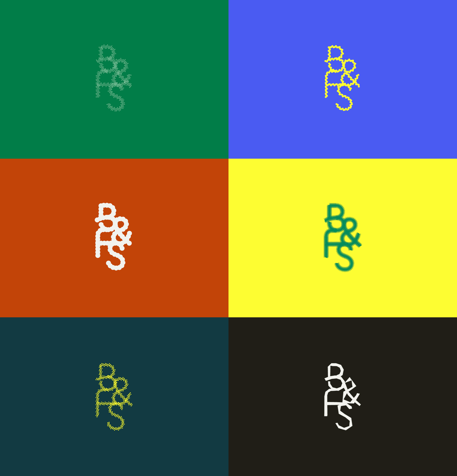
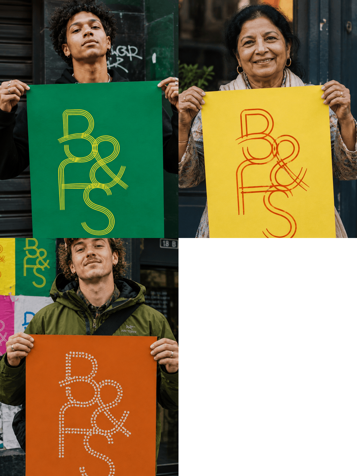
This project is about people, not places. Residents feel a real connection to the town and to each other, but nothing in the old identity showed it. So we made connection the starting point. The new monogram is drawn as a single set of fluid paths. You can read them as the routes through the town, the streets, canal towpaths and footpaths that everyone shares, whoever they are and wherever they came from. The paths give the mark its fixed structure. The stroke laid over them can be resized, so the same letters can be fine and light on a letterhead or bold and heavy on a street flag without changing shape. That is the town’s story told simply: a shared shape with plenty of room for difference. Its simplicity is its power. A resizable stroke was only the beginning, though. The workshop was full of the diversity and energy of the place, and we wanted the identity to have room for all of it. So we built the Living Logo Tool. The paths of the monogram never change, so it stays legible wherever it appears, but residents can decide what runs along them. They can apply their own shapes, colours and strokes, make their own version of the mark, and then see it used in council communications around the town. The same flexibility lets the identity change with the seasons and community events without losing its core, so the brand becomes something people take part in and want to stand behind. When the council needs to speak with authority, the lock-up in yellow and dark green does that job on anything official. Around it, a wider palette of magenta, red, green and blue gives events and campaigns room to relax. Every colour pairing is checked against WCAG 2 and APCA using Palette Lab, the contrast tool we built during the project. Atkinson Hyperlegible keeps the type clear for every reader. The result is an identity that is official when it has to be and a celebration when it doesn’t. A town long judged on where it’s been, now free to choose where it’s going.
Team on this project
- Fred Thonger , Creative Direction
- Alexa Soromenho, Design & Development
- Pete Spicer, Strategy


Related Work


Creating structure
Client:MECO
Services:Brand + Strategy / Web + App
...
Creating structure

Momentum needs a nudge
Client:Domino Consulting
Services:Brand + Strategy / Web + App
...
Momentum needs a nudge




Change in motion
Client:Fumopay
Services:Web + App / Film + Animation
...


