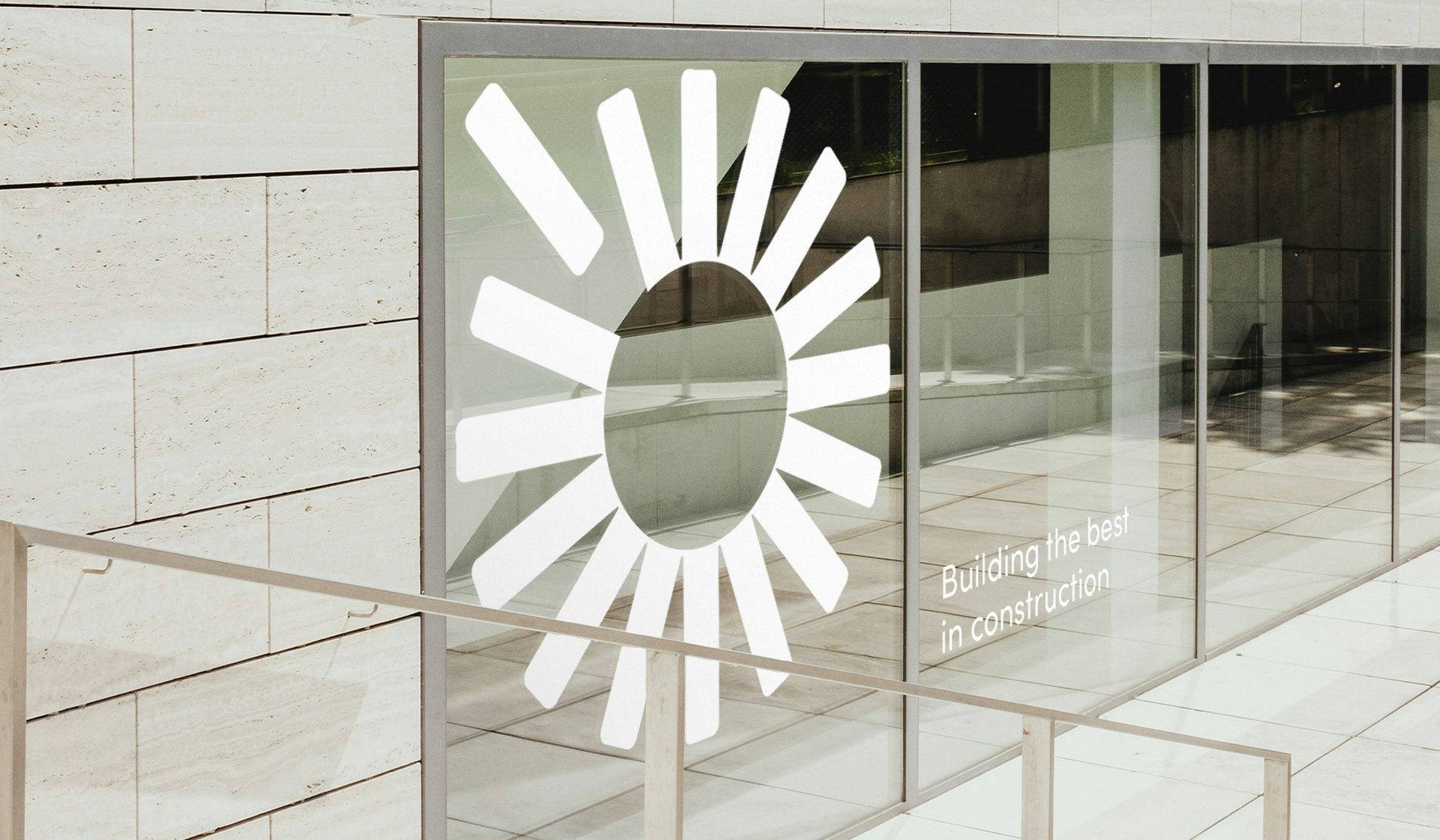
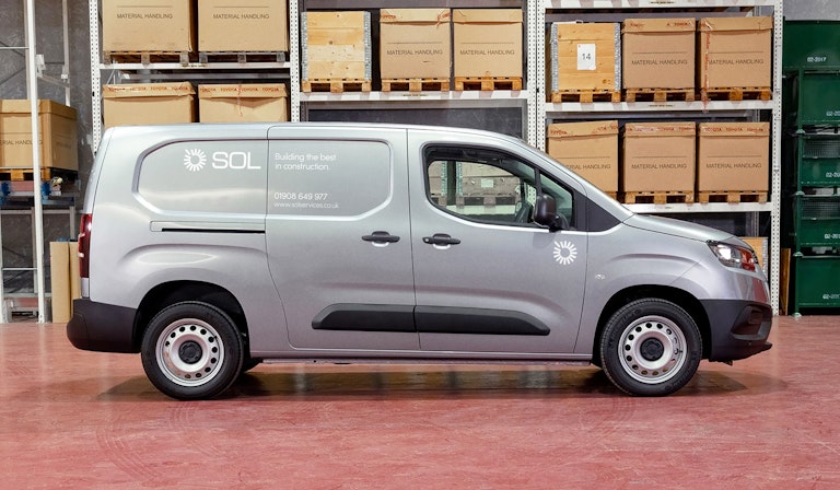
When SOL Services commissioned us as their branding agency, we built their brand identity from the ground up. Producing brand guidelines, a new website and marketing comms.
SOL build beautiful spaces through creative construction and intelligent design. It was only fitting that we refreshed their brand with the same level of craft and attention to detail.
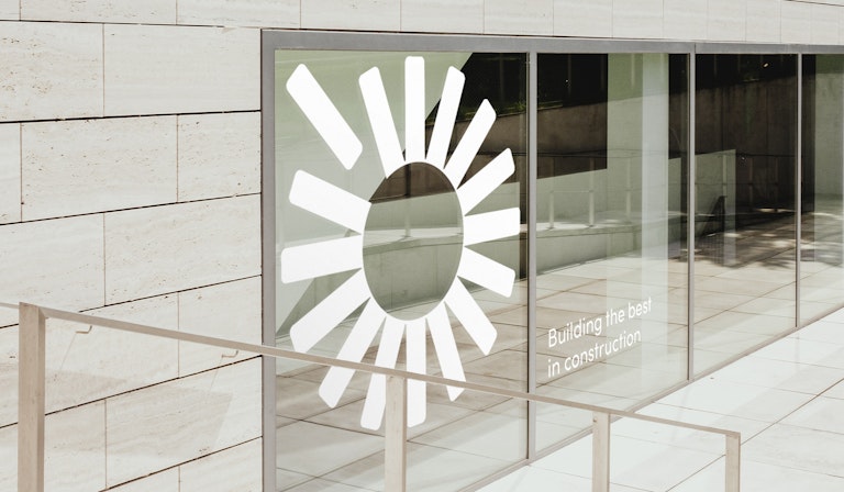
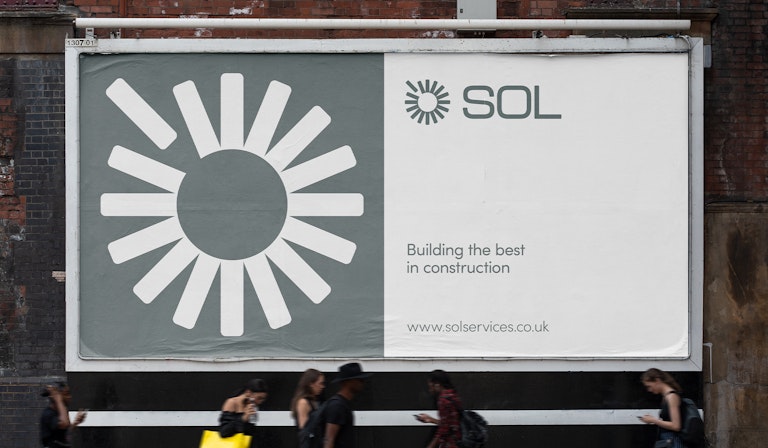
We created the new logo with a nod to the original thinking from when the business was formed. The shape reflects the origins of the name, Sol being Spanish for Sun. And the connected elements that build the logo represent SOL's services, and the process of construction. Creating something striking from the constituent parts.
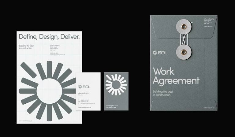
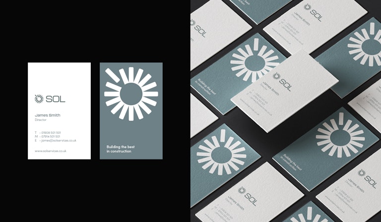
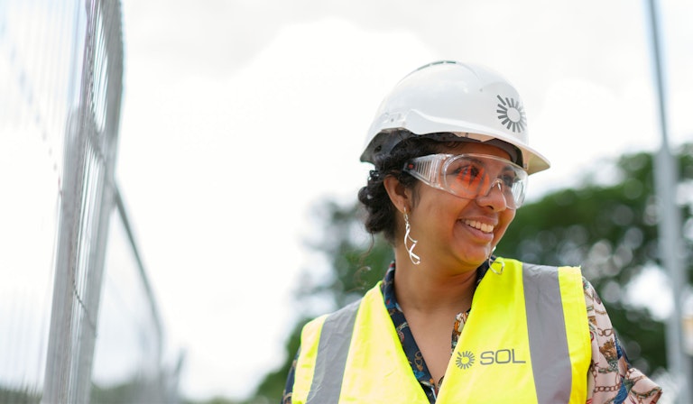
Once we had the foundation of the brand marque, we could build out the supporting brand elements. Selecting a typeface that's solid and contemporary, and using earthy neutral tones for the colour palette, that reflect and compliment the materials used in the construction industry.

Next project
